
A bar chart is not just a technical output ù it is a designed communication. Every axis label, colour choice, and grid line either aids or hinders understanding. Data visualisation is UX for numbers.
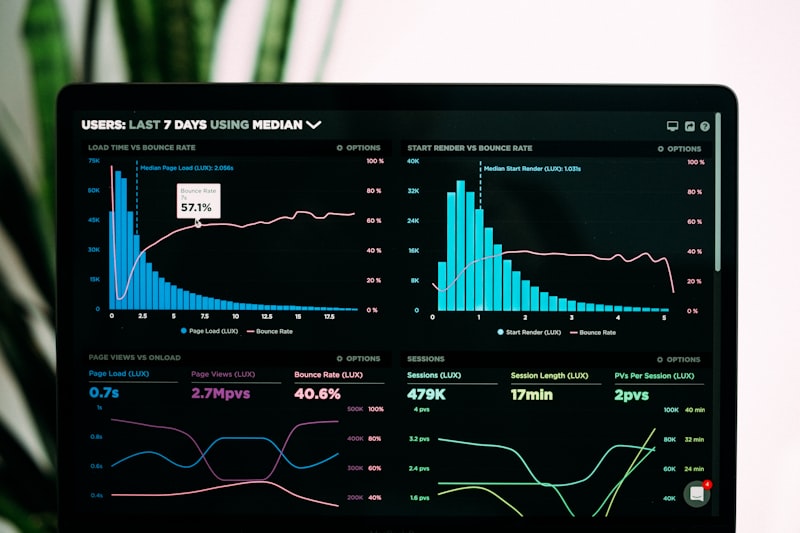
Choose the Right Chart Type First
Keep reading
Related Articles

UX Design
 May 24, 2026
1 min read
May 24, 2026
1 min read
The Psychology of Micro-interactions in UX
Micro-interactions are the tiny moments that make digital products feel alive. Learn how these design details…

UX Design
May 18, 2026
1 min read
How to Run a UX Audit in Under a Day
A practical, step-by-step framework for identifying your biggest UX problems without scheduling a month of…

UX Design
May 16, 2026
1 min read
Designing for Accessibility: The Business Case
Accessibility is often treated as a compliance checkbox. But teams that treat it as a design principle ship…

UX Design
May 10, 2026
1 min read
The 5 Heuristics That Actually Matter in 2025
Nielsen published his 10 heuristics in 1994. Here is how they hold up today and which five deserve your full…

UX Design
May 4, 2026
1 min read
Gestalt Principles: The Hidden Rules of Visual Perception
Gestalt psychology explains how humans naturally group and organise visual information. Understanding these…

UX Design
Apr 28, 2026
1 min read
Designing for Stress: What Happens When Users Are Overwhelmed
When users are under cognitive load, every design decision is amplified. Here is how to design systems that…